
TL;DR (Quick Summary)
- Effective B2B SaaS pricing pages make pricing clear, transparent, and easy to compare.
- Leading SaaS companies use distinct layouts, feature comparisons, and calls to action to guide buyers.
- The best pricing pages communicate value rather than simply listing prices.
- Studying real examples can help SaaS businesses improve usability, reduce buying friction, and support conversions.
The right pricing page can help close a deal.
B2B buyers want to know what they are paying for, what they’re getting and how it will suit their business. If you have a complicated pricing structure, it can be difficult for them to compare options and this can cause friction.
A well designed pricing page not only tells buyers how much they will pay for a subscription, but can also increase trust and show the value behind your product.
This matters to buyers: in TrustRadius’s B2B Buying Disconnect Report, 51% of respondents evaluating enterprise-priced purchases said they wished all vendors provided transparent pricing.
SaaS companies often have varying pricing page structures – some simple and others with complex feature comparisons.
In this article, we have analysed 12 real examples of B2B SaaS pricing pages. We will look at why they work well and give you actionable tips to improve your page.
What Makes a Good B2B SaaS Pricing Page?
An effective B2B SaaS pricing page will help your prospects to easily see the available options and choose the plan they want. The plan should also show them the value of each option.
G2’s pricing transparency analysis found that only 4% of product profiles on its marketplace explicitly listed prices. That figure describes G2 profiles, not SaaS pricing pages themselves, but it highlights how difficult clear pricing information can be to find.
Here are 5 factors to include on an effective pricing page.
- Transparent pricing: Be clear with your customers how much they’ll pay for using your subscription and what it’s charged for. Make sure any extra costs can be clearly seen.
- Clear plan descriptions: Help your readers to understand which plan is right for them and why it’s different.
- Comparison tables: Easily show your readers how the features, usage limits and support differ between plans.
- Strong CTAs: Make it easy for your readers to know what they should do next. Whether they want to start their free trial, book a demo or get in touch with sales.
- Enterprise options: If your enterprise customers want custom pricing, security needs or extra support then you should have a clear way for them to buy.
This will help to reduce any friction throughout the buying process and for your customers to be confident they’ve chosen the best option for their needs.
12 B2B SaaS Pricing Page Examples Worth Studying
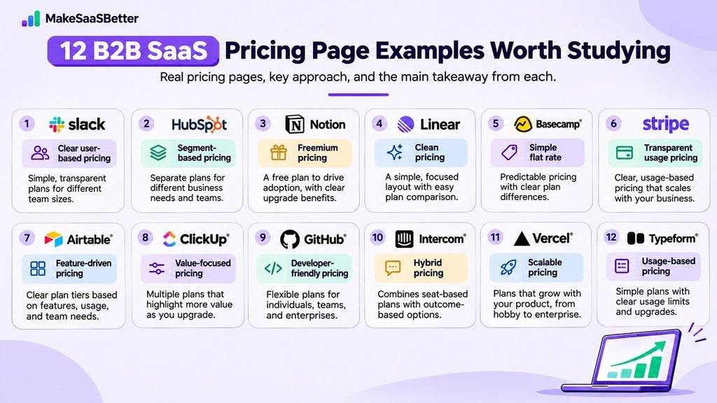
You don’t need a single pricing page design. While some B2B SaaS companies will have a very simple pricing model, others will display in-depth comparisons so you can easily compare the features, usage limitations, and enterprise needs.
Here are 12 examples of how you can lay out your pricing page. They also provide valuable tips for any SaaS business that wants to improve its pricing page.
1. Slack – Clear User Based Pricing
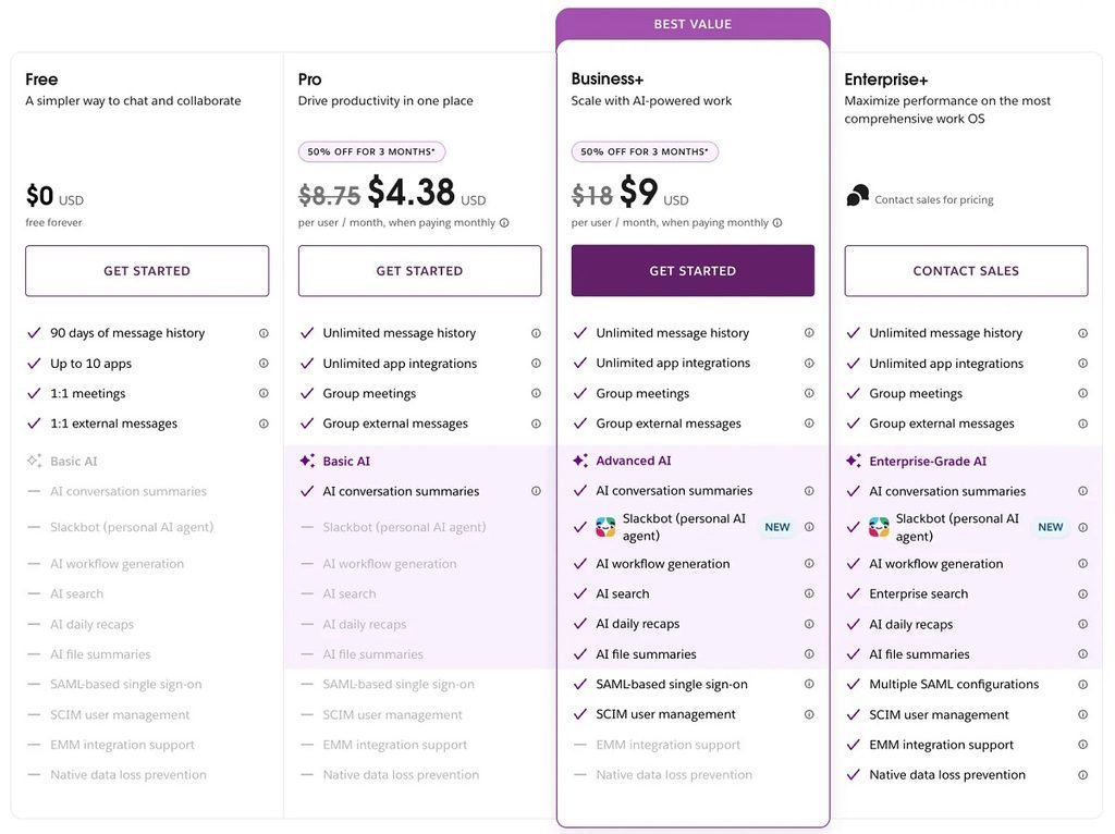
The pricing page on Slack has a very clear breakdown of the Free, Pro, Business+ and Enterprise+ packages. It shows what you get for each tier and lets you see how much you’ll pay per month vs per year. This means you can easily work out what is best for your team and what you want to upgrade.
What works well:
They have highlighted some key differences such as messaging history, integrations and advanced features.
Takeaway:
When using user based pricing ensure you provide clear information about what the customer gets for each tier. This will help your team decide if the extra cost is worth it.
2. HubSpot – Segment Based Pricing
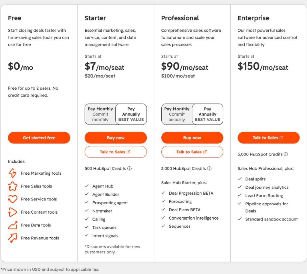
The pricing page on HubSpot shows different packages based on different needs for your business.
What works well:
The products and tiers have been separated, so customers can see what features they would get. As there are many products to choose from and many elements to the pricing, there will be a lot of consideration needed.
Takeaway:
If your SaaS is used by different departments or different customer segments then consider segmenting your pricing. Ensure it’s easy to see what is included in each package.
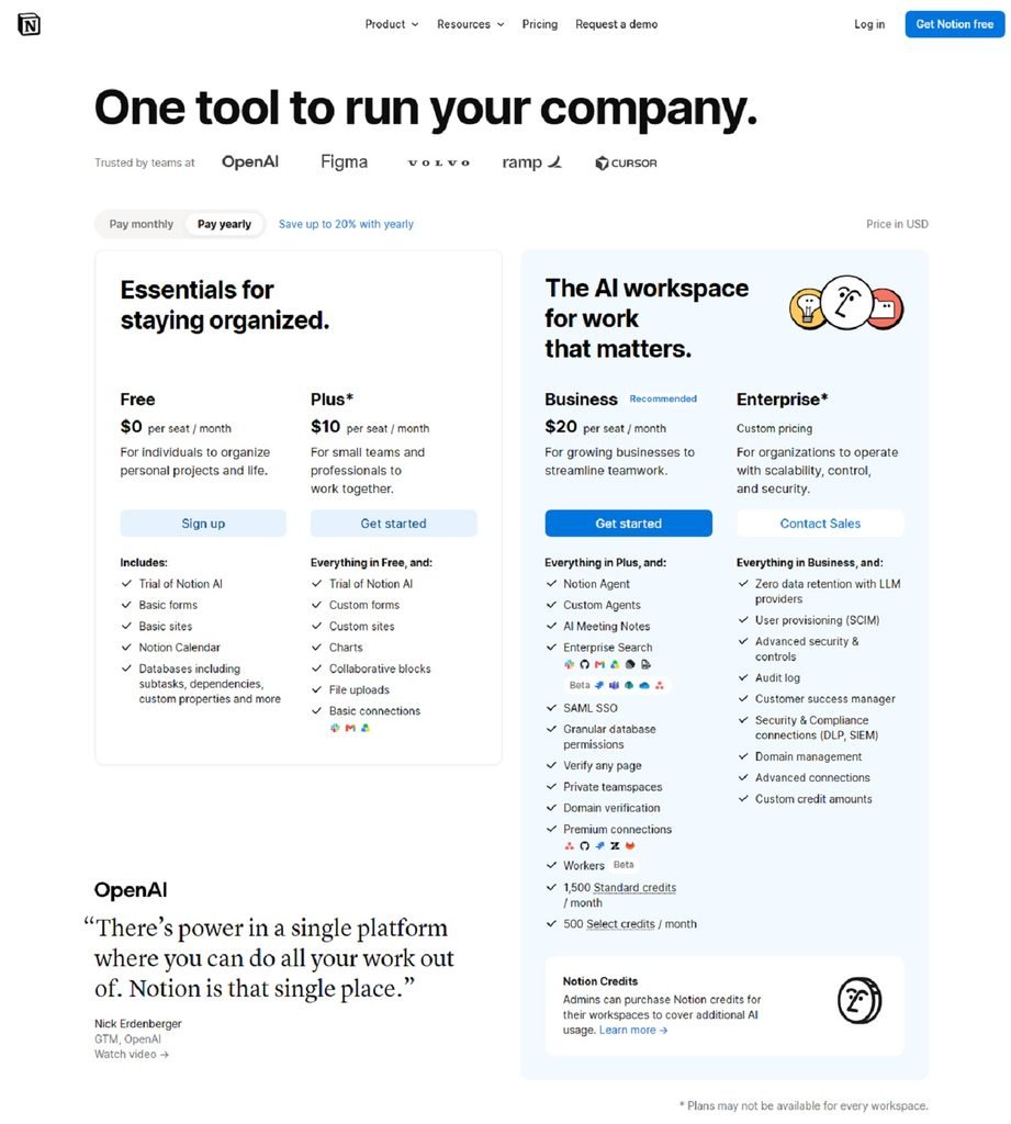
3. Notion – Freemium Pricing
The pricing page on Notion has a free tier, alongside paid packages for teams with more advanced collaboration and admin features.
What works well:
Customers can start with the Free tier and see what they can get as they scale. It’s clear how you can move from an individual to a team.
Takeaway:
Ensure your free tier shows the value in your product. Customers should be able to clearly see the benefits of upgrading. Highlight what extra features they’ll get.
4. Linear – Clean Pricing
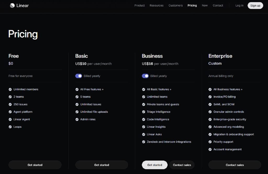
The pricing page on Linear has a clean layout showing the different packages (Free, Basic, Business, Enterprise). A quick summary of features is provided alongside what the next step is.
What works well:
It’s focused on showing the key differences. Team size, advanced features and enterprise features are shown. There is also a detailed comparison so customers know what they’re getting.
Takeaway:
Keep it simple. If your product is complex then having a clean layout will make it easier to understand. Provide detailed comparisons for customers who need more information.
5. Basecamp – Simple Flat Rate
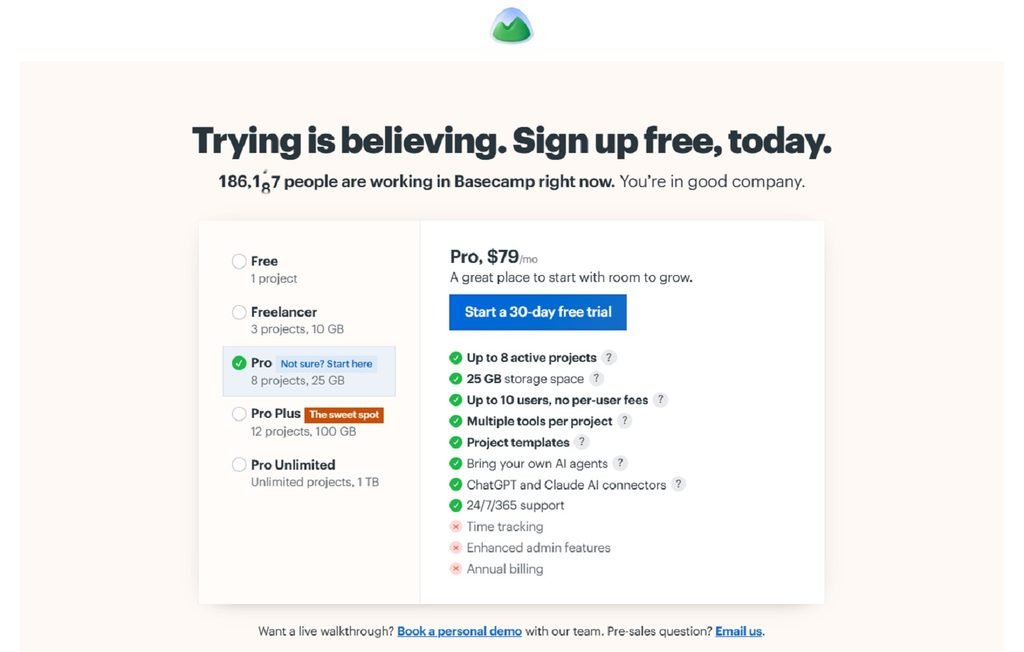
The pricing page on Basecamp focuses on flat rate subscriptions. Different packages are shown depending on how many projects you can have, storage and other needs.
What works well:
They’re addressing the concern of costs increasing. Customers know what the key differences are in the pricing.
Takeaway:
Show what makes your pricing stand out. If you want to highlight that your costs are predictable then make sure it’s clear.
6. Stripe – Clear Transaction Based Pricing
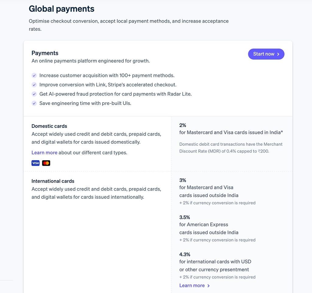
The pricing page on Stripe shows the costs of processing payments. Information is given on extra products and services.
What works well:
They’ve explained the pricing in terms of transactions. Businesses can easily see how much they’ll be paying based on their payments. Customers can also look into specific services.
Takeaway:
If your pricing is based on usage or transactions then ensure the unit is clear. Explain any extra costs. Customers should be able to have an idea of how much they’ll be spending.
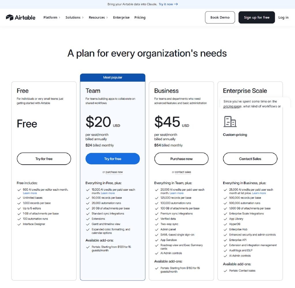
7. Airtable – Clear feature differentiation
Airtable‘s pricing page gives teams the ability to compare between the plans based on collaborative functionality, features and limitations. We can also see how Airtable will charge for any paid seats.
What works well:
Airtable has given us clear information about how much they will charge for the paid seats. Businesses will know what they can expect to pay.
Takeaway:
Not just give customers information about features for each pricing tier. Give them information about the permissions users will have, limitations and how much they will be charged. This is important if multiple people within your company will need to use your product.
8. ClickUp – Show value of software
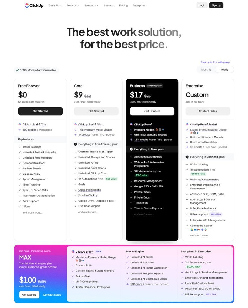
ClickUp‘s pricing page not only shows the subscription plans but also has a tool to show how much you can save using ClickUp.
What works well:
This tool helps customers understand the value of ClickUp.
Takeaway:
If your product is helping replace multiple tools or reduce costs, show this with a comparison. Be clear with your assumptions so customers can decide if they can save money.
9. GitHub – Multiple options
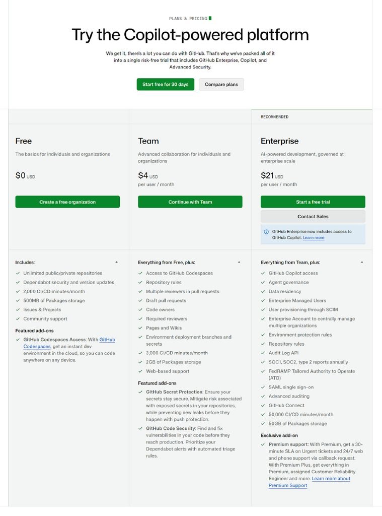
GitHub‘s pricing page shows the options available to individual developers, teams and enterprises.
What works well:
GitHub has made it clear how each plan provides different collaborative, security, admin and organisational features. Customers will know when they need to upgrade past the basic plan.
Takeaway:
If your product is used by smaller teams and enterprises, make sure you highlight what features become important at larger scales. Security, admin and support can be more
important factors when purchasing.
10. Intercom – Hybrid pricing
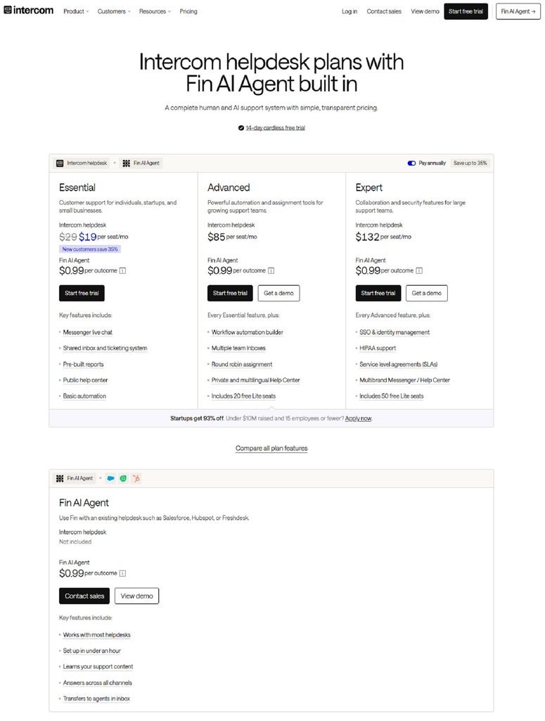
Intercom‘s pricing page has a hybrid pricing model which means you can pay for seats and outcome based pricing for their Fin AI Agent. You can also compare between the different support platform plans and know how much you’ll be paying based on how much AI you use.
What works well:
Intercom has separated the different prices. Businesses will know what they’re paying for.
Takeaway:
If your SaaS product uses a hybrid model, make sure you’re clear with the different charges. Customers will want to know what they’re paying regularly and what will incur extra charges.
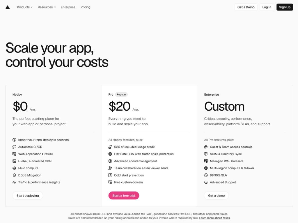
11. Vercel – Scalable pricing
Vercel‘s pricing page has three pricing tiers available – Hobby, Pro and Enterprise. Each plan provides different infrastructure, collaborative, security and support features.
What works well:
Each plan is linked to a specific stage of your product development. Customers will know where to start and what features they will get as their applications scale.
Takeaway:
Create plans based around how your customers will scale. Make sure the progression between each plan makes sense. Infrastructure and enterprise can contribute to overall spend.
12. Typeform – Usage limits
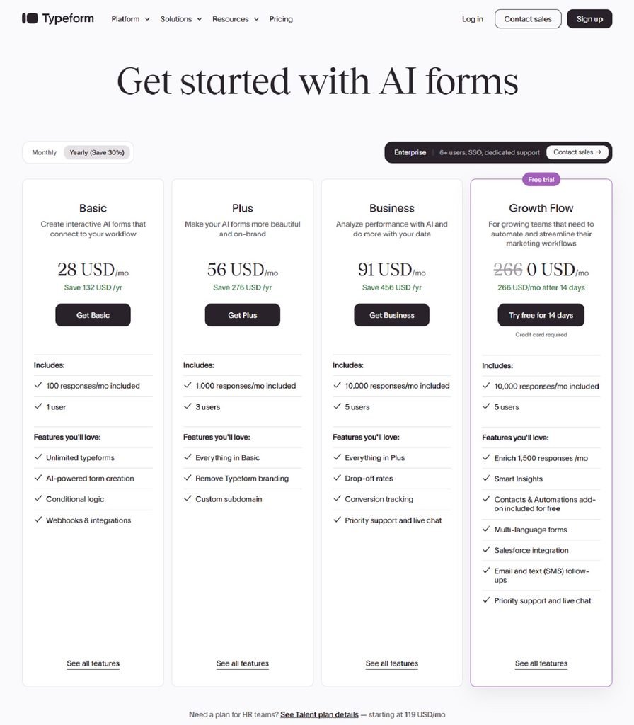
Typeform‘s pricing page has different options available depending on what your business needs – forms, growth and enterprise.
What works well:
Typeform has given information on each plan. Customers will know what features they can expect and how much they can use.
Takeaway:
If your product has usage limitations, make them easily comparable. Customers will want to know what will happen if their needs increase and if upgrading will provide them with enough capacity.
What the Best B2B SaaS Pricing Pages Have in Common
Whilst each of the 12 SaaS companies have different pricing strategies there are a few similarities we see across the landing pages.
These are:
- Clear plan breakdowns – GitHub and Vercel make it clear how their different plans will suit a customer’s needs.
- Transparent pricing breakdown – Stripe and Intercom help customers understand by clearly explaining what’s included in their pricing.
- Simple comparisons – Slack and Airtable help customers compare features across different plans.
- Highlight value – ClickUp show how much you could save with their offering and Basecamp show how their pricing is predictable.
- Clear call to actions – The pricing page will have clear calls to action such as start your free trial, select your plan or contact sales.
The main thing we take from these examples is that your pricing page should be simple and help customers make a purchase decision. It should explain what they’ll get and why a certain plan suits their business. They should prioritise the features that matter most, with detailed comparisons available when needed.
Common SaaS Pricing Page Mistakes to Avoid
A good looking pricing page does nothing if buyers can’t easily navigate through their choices. Here are 4 common mistakes B2B SaaS businesses often make:
Over-Complicated Options
Too many options can cause buyers confusion. The key is to ensure there are clearly differentiators between each option.
Additional Cost Traps
Any unexpected costs, such as usage charges, extras and restrictions on your pricing will cause confusion and build a lack of confidence. Ensure that any buyer knows what is included in you plans.
Vague Call To Actions
This could leave your buyer’s confused about the next steps. Ensure that there is a clear call to action to help with this, such as ‘Start Free Trial’ or ‘Book a Demo’.
Too Many Features
Having too many features on this page can be very confusing, so ensure that you include only the most relevant benefits from your product. If having detailed comparison is essential then terms from include in more detail.
How to Improve Your B2B SaaS Pricing Page
The goal is to improve your pricing page and enable your visitors to understand how your product will provide value.
According to G2’s Buyer Behavior Report, nearly two-thirds of surveyed buyers prefer speaking to vendors only later in their buying journey. This makes it useful to answer common pricing questions before a buyer contacts sales.
There are 5 things you can use:-
1. Know Who Your Ideal Customer Is
Know what matters to your target audience. Whether is it cost, scalability, extra features, or predictability of cost, deciding these will help dictate your pricing message.
2. Highlight Differences in Each Plan
Inform buyers by showing what features and benefits each different plan has.
3. Make Purchasing Simple
Use clear call-to-actions. Inform customers about your costs well so they know exactly how much they will be paying. And be clear on each plan and pricing so you make purchasing as simple as possible.
4. Be Transparent
Most importantly tell your customers any limitations on usage, extra costs and any contracts to let them know how much they could be paying.
5. Experiment
Mess around with how you lay out your pricing page, messaging, and call-to-actions. Track how many conversions, trial signups and demo requests you get. And also track how your SaaS metrics are doing. This will help give insight to what is helping you improve.
By experimenting you are ensuring your pricing page will enable you to deliver what your customers expect and help grow your business.
Build a Pricing Page That Helps Buyers Decide
Your B2B SaaS pricing page is a great opportunity to showcase the value of your product and give confidence to buyers to purchase.
There are many examples of how you can structure your pricing page (as shown in the 12 examples). Companies such as Slack, Stripe and Intercom each have a different approach depending on what they offer, who their customers are and how they price.
A good pricing page will make it easier for someone to decide what they want. A clear breakdown of each plan, pricing details, relevant copy and clear CTAs should help.
Also consider how your pricing page will adapt as your customers’ expectations change. By regularly reviewing your pricing page, you can identify areas to improve the purchasing experience.
Is your pricing page helping customers make an informed decision, or causing them frustration?
Frequently Asked Questions
1. What should be included on a good SaaS pricing page?
A good SaaS pricing page will show customers how much it costs to subscribe to your service. They should be able to easily see what each plan offers, how they differ and the benefits of using your product.
2. How many pricing tiers should we have?
Many SaaS companies provide three or four pricing levels. This isn’t a fixed rule and the best option is depending on your customer base, features that your product provides and how you are pricing your different tiers.
3. Should we show our pricing?
This can make things more transparent and customers can easily see if they can afford your product. If your B2B SaaS provider complex Enterprise solutions then perhaps you may want to provide bespoke quotes.
4. How do I increase conversions on my SaaS pricing page?
Make it easy to compare features between your different pricing options. Highlight the main benefits of choosing your product. Make sure that billing is clear and easy to understand. Also ensure that CTA’s are prominent. Try different layouts and messaging to help improve conversion.
5. How often should I review my SaaS pricing page?
Review it when you change plans, add features, update billing rules, or notice changes in conversion performance. Regular checks can also help you identify confusing messaging or outdated information.
