
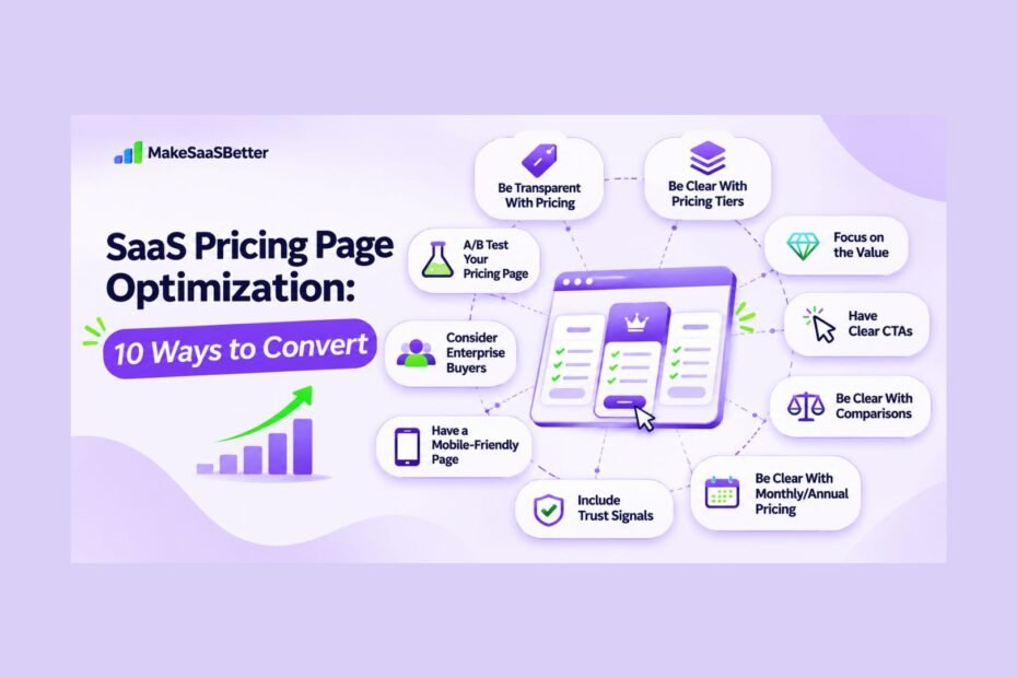
TL;DR (Quick Summary)
- SaaS pricing page optimization helps turn more visitors into free trials, demo requests, and paying customers.
- Clear pricing, simple plans, and compelling CTAs make buying decisions easier.
- Trust signals, mobile-friendly design, and transparent billing reduce buyer hesitation.
- Regular A/B testing helps identify improvements that drive conversions.
Your pricing page is often where potential customers make their final decision about paying for your SaaS product. However, unclear plans, confusing pricing, and poorly worded CTAs can make that decision harder.
Pricing transparency remains a challenge in B2B SaaS. According to DataDab’s 2026 B2B SaaS Pricing Transparency Study, only 48.9% of the 479 YC-backed B2B software companies analyzed displayed pricing information on their websites.
But there’s more to transparent pricing than showing how much something costs. Buyers also need to understand what they’re paying for and which plan best suits their needs.
In this guide, we’ll look at 10 ways to optimize your SaaS pricing page, address buyer concerns, improve clarity, and increase conversions.
What Is SaaS Pricing Page Optimization?
SaaS pricing page optimization is the process of improving your pricing page to help more visitors become customers.
It involves making your pricing easier to understand, simplifying plan comparisons, and improving calls to action so customers can find what they need.
This is different from changing your pricing strategy or increasing subscription costs.
Instead, the focus is on creating a better experience for potential customers. Your pricing page should help them understand what your product offers, choose a suitable plan, and take the next step, whether that’s signing up for a free trial or requesting a demo.
Why Pricing Page Optimization Matters
Your pricing page plays an important role in turning interested visitors into paying customers. If your plans are confusing or your pricing is unclear, potential customers may hesitate or leave without purchasing.
An optimized pricing page helps buyers compare options, understand what they’re getting, and feel more confident about their decisions.
It also supports your overall B2B SaaS growth strategy by improving trial sign-ups, demo requests, and opportunities to convert visitors into customers.
Even small changes to pricing clarity, CTAs, and the purchasing process can reduce friction and make it easier for customers to move forward.
10 Ways to Optimize Your SaaS Pricing Page
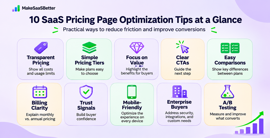
A good SaaS pricing page should make it easy for visitors to understand their options and decide what to do next. Here are 10 practical ways to improve the experience.
1. Be Transparent With Pricing
Make sure visitors can easily understand how much they’ll pay for a subscription, how often they’ll be billed, what usage is included, and whether there are additional charges.
If your pricing depends on usage or team size, clearly explain how those costs are calculated.
This helps buyers estimate their expenses before making a commitment.
2. Be Clear With Your Pricing Tiers
Avoid offering too many pricing tiers or making the differences between plans difficult to understand.
Each tier should reflect what your customers need and the value they’ll receive.
If you’re exploring different pricing structures, our guide to B2B SaaS pricing models explains the available approaches and when they make sense.
3. Focus on the Value
Instead of overwhelming customers with a long list of features, explain how each plan helps them solve a problem.
For example, rather than simply mentioning advanced analytics, explain how those capabilities help teams understand performance and make better decisions.
Focus on the outcomes your target customers care about.
4. Have Clear CTAs
Your calls to action should match what customers are ready to do.
Use clear wording such as “Start Free Trial,” “Get Started,” or “Contact Sales,” depending on the buying process.
Make sure these buttons are easy to find and that visitors understand what happens after clicking them.
5. Be Clear With Comparisons
Customers should be able to identify the main differences between your plans without reading every feature description.
Use comparison tables, short explanations, and clear information about limitations.
Highlight features that influence purchasing decisions, such as integrations, storage, security, and support.
Avoid technical jargon that doesn’t help customers choose.
6. Be Clear With Monthly and Annual Pricing
Make it easy for customers to compare monthly and annual subscriptions.
Show how much they’ll pay, whether annual billing offers a discount, and if there are any contract commitments.
If your product includes variable costs, explain those separately.
This helps customers understand their potential expenses before subscribing.
7. Include Trust Signals
Pricing pages are often visited by customers who are close to making a purchase but still need reassurance.
Include relevant testimonials, recognizable customer logos, security information, or guarantees near important decision points.
Make sure these trust signals address genuine concerns rather than simply taking up space.
8. Have a Mobile-Friendly Page
A pricing page that’s difficult to navigate on mobile can discourage potential customers.
Ensure pricing cards are readable, billing toggles work properly, and CTAs are easy to click.
Optimize images, avoid unnecessary heavy scripts, and check that your page loads quickly across devices.
9. Consider Enterprise Buyers
Enterprise buyers often need more information than a standard pricing table provides.
Make sure they can easily find details about security, integrations, onboarding, support, and custom contracts.
Provide a clear way to contact sales so purchasing teams can move forward without unnecessary delays or unanswered questions.
10. A/B Test Your Pricing Page
Don’t assume your pricing page will convert well simply because it looks good.
Test individual elements such as CTA wording, pricing descriptions, billing options, and feature comparisons.
Track meaningful metrics, including trial sign-ups, qualified demo requests, and paid conversions.
Use what you learn to make informed improvements rather than relying on assumptions.
Real SaaS Pricing Page Optimization Examples
A well-designed SaaS pricing page helps customers understand their options and make decisions. Here are five brands demonstrating different approaches.
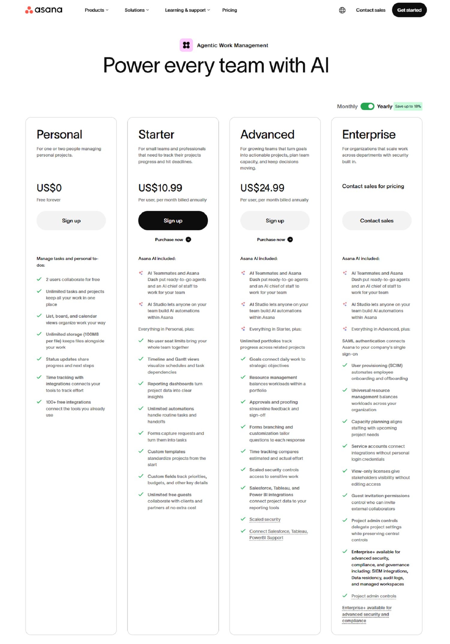
1. Asana – Clarify What Each Plan Is For
Asana explains who its different plans are designed for, from individuals and growing teams to larger enterprises. It also provides different purchasing paths for self-service and enterprise customers.
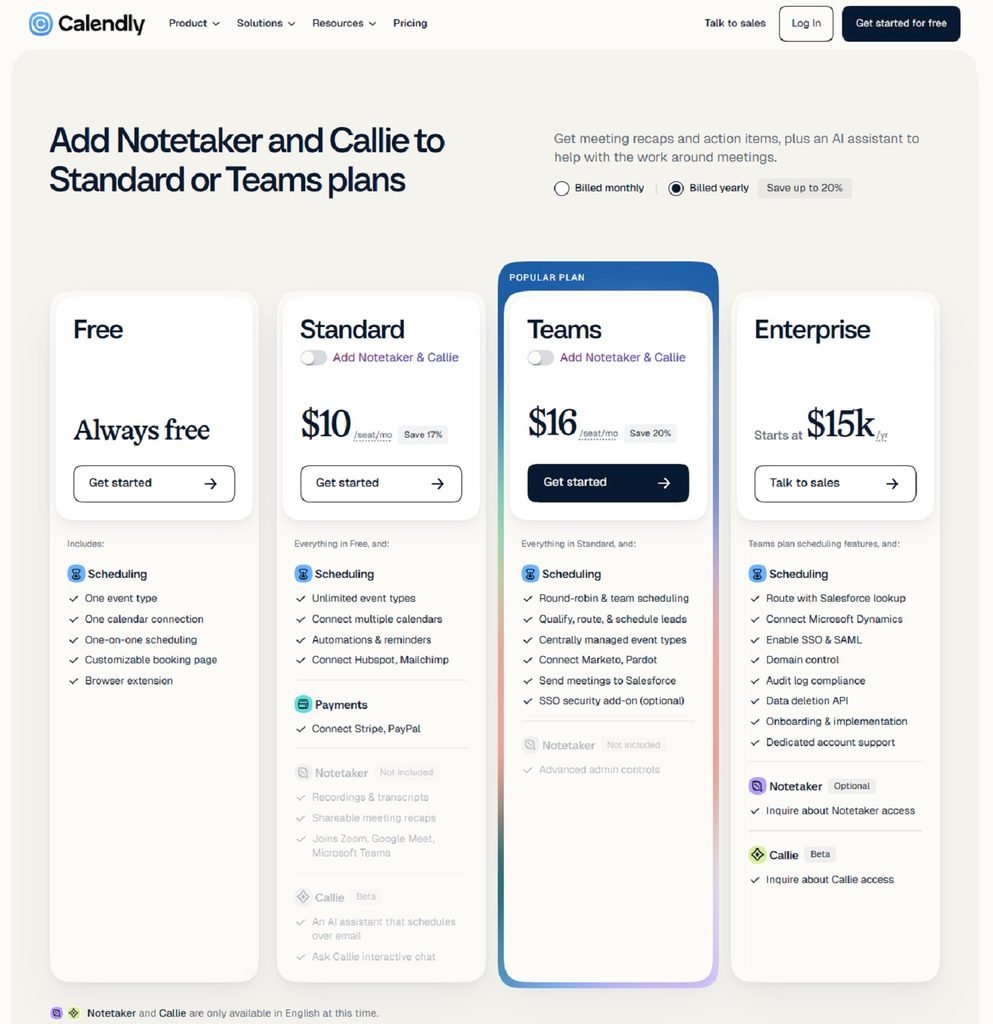
2. Calendly – Clear Payment Options
Calendly displays monthly and annual billing options alongside plan features, making it easier for buyers to compare subscription costs and understand their commitments.
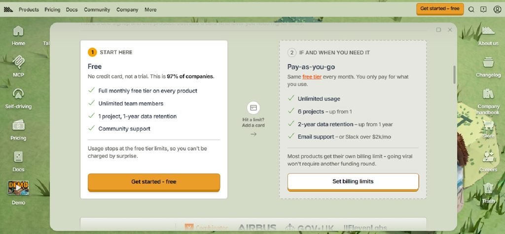
3. PostHog – Show Costs Based on Usage
PostHog provides a pricing calculator, free usage allowances, and spending controls. These help buyers estimate costs when their usage increases.
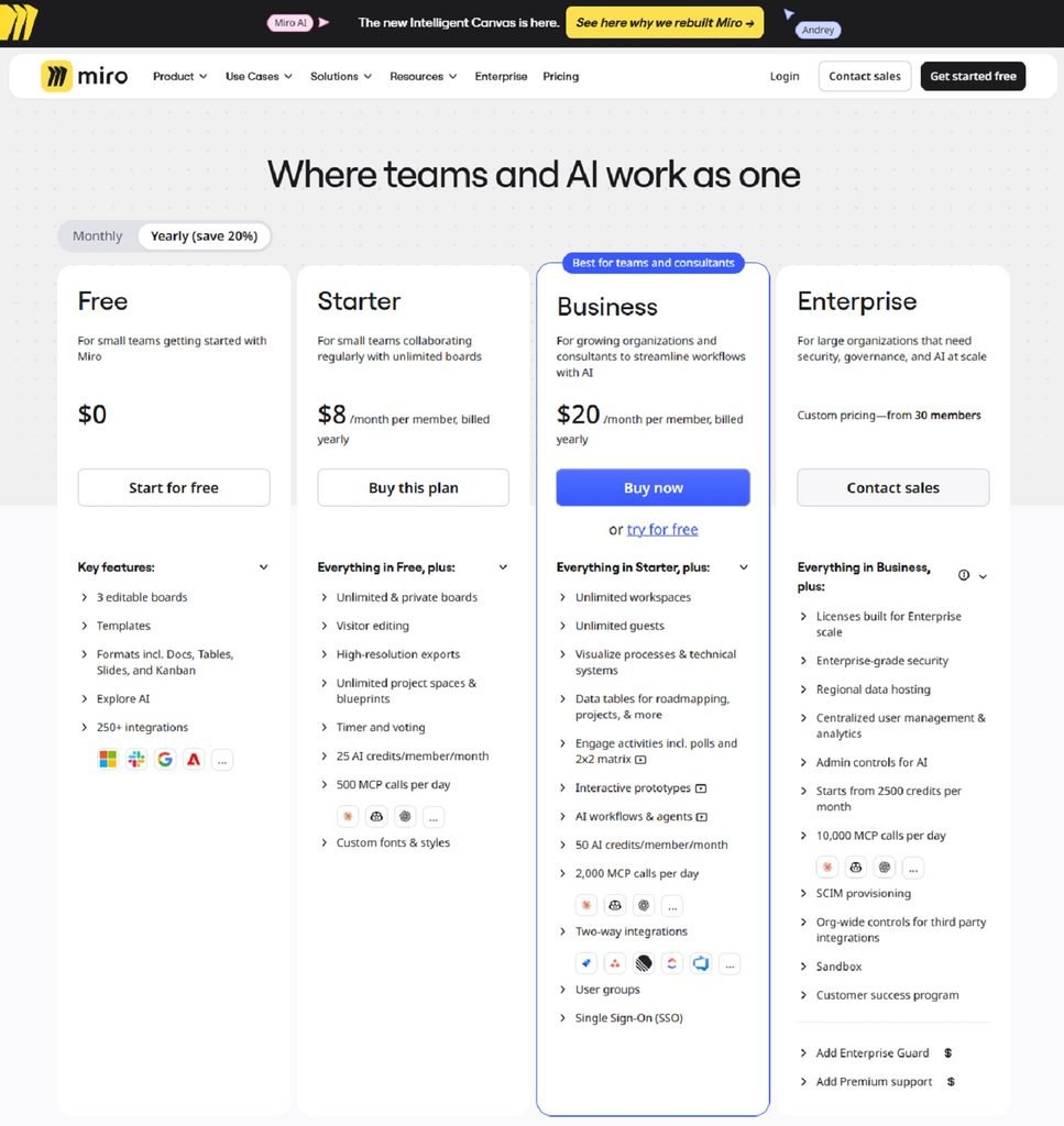
4. Miro – Highlight the Benefits of Upgrading
Miro highlights additional collaboration features and AI allowances across its plans, helping customers understand what they gain by upgrading.
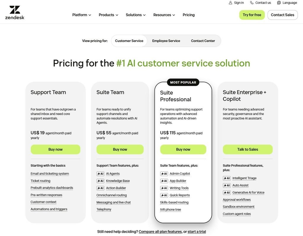
5. Zendesk – Make Feature Comparisons Easier
Zendesk allows buyers to compare plans and focus on feature differences, making it easier to identify which capabilities are available at each level.
For more inspiration, explore our 12 B2B SaaS pricing page examples and the lessons they offer.
How to Measure Pricing Page Optimization Success
If you’re optimizing your pricing page, focus on the metrics that show whether your changes are working. Don’t just measure traffic. Look at how visitors move from viewing your pricing to becoming customers.
Five key metrics to track:
- Pricing page conversion rate: The percentage of visitors who take a desired action, such as signing up for a trial or requesting a demo.
- CTA click-through rate: The percentage of visitors who click your main calls to action.
- Trial-to-paid conversion rate: The percentage of trial users who become paying customers.
- Demo-to-customer conversion rate: The percentage of demo requests that eventually result in paying customers.
- Revenue per visitor: How much revenue your business generates relative to the number of pricing page visitors.
Use analytics and A/B testing to compare results before and after making changes. You should also look at performance across different traffic sources and customer segments.
Ultimately, the goal is to attract qualified customers and improve revenue, not simply generate more clicks.
Common Pricing Page Optimization Mistakes
Several common mistakes can make your SaaS pricing page confusing and discourage potential customers from converting.
Here are five to avoid:
- Too many pricing options: Offering too many plans can overwhelm buyers and make comparisons difficult.
- Unclear pricing: Hidden fees or confusing usage charges can reduce trust.
- Vague CTAs: Generic or poorly placed buttons make it harder for visitors to take the next step.
- Long comparison charts: Overly complicated tables can distract buyers from the differences that matter.
- Ignoring performance data: Making changes without testing or tracking results can lead to ineffective decisions.
Avoiding these mistakes helps create a clearer pricing experience and makes it easier for customers to choose the right plan.
Conclusion
Your SaaS pricing page should do more than display subscription costs. It should help potential customers understand your product’s value, compare their options, and confidently take the next step.
Optimizing your pricing page doesn’t have to involve a complete redesign. Small improvements in pricing clarity, plan descriptions, calls to action, and billing information can make the buying process easier.
However, not every change will deliver the same results. Understanding where visitors hesitate, testing improvements, and tracking meaningful conversion metrics will help you identify what works for your audience.
Start by reviewing your existing pricing page from a customer’s perspective. Are your plans easy to compare? Are costs clearly explained? Is the next step obvious?
The goal is to remove unnecessary friction and make choosing your SaaS product easier.
Frequently Asked Questions
What is SaaS pricing page optimization?
It’s the process of improving pricing clarity, plan comparisons, and calls to action to help more visitors become customers.
How do I calculate my pricing page conversion rate?
Divide the number of visitors who complete a desired action by the total number of pricing page visitors, then multiply by 100.
What should I A/B test on my SaaS pricing page?
Test CTA wording, pricing layouts, plan descriptions, billing options, and feature comparisons to identify what improves conversions.
How do I improve my pricing page without reducing the price?
Make plans easier to compare, focus on customer benefits, explain costs clearly, and remove unnecessary steps from the buying process.
What is a good conversion rate for a B2B SaaS pricing page?
There’s no universal benchmark. Conversion rates vary depending on your audience, pricing structure, traffic quality, and whether you’re measuring trial sign-ups, demo requests, or purchases.
